Directory
Useful for locating a known service, but it leaves priority and sequence to the user.
Independent concept · UX/UI + prototype
A clearer next step in a new country. I designed a personal action plan that helps newcomers choose a task, compare options and prepare for a visit.
UX/UI design and prototype implementation
Interactive mobile journey with three decision screens
Independent concept prototype, not a live service
Problem
A newcomer may need to deal with ministries, banks, health funds and appointments in parallel. Each service can explain itself, but the person still has to work out the order, dependencies and preparation.
I framed the design problem as: how can a mobile guide make the next useful step visible while leaving the final choice with the person?
Chosen direction
A directory helps when someone already knows what to find. Chat helps with a specific question. Neither makes a longer sequence or its progress visible by default.
Working prototype
Start with the personal plan, compare fictional bank offers, prepare for a visit and make a sample booking.
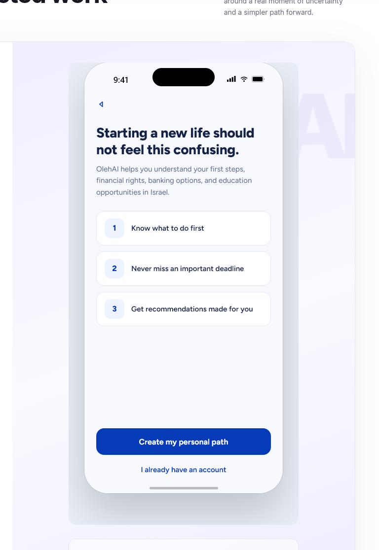
Interactive prototype · English demo
Starts on the welcome screen · English
UX and interface
I narrowed the concept to a single bank-opening task so the prototype could show continuity rather than a collection of disconnected screens. Select a numbered marker to highlight the interface choice described below it.
1 Find a next step

I brought one task forward with a reason, while keeping “Choose another task” visible.
2 Compare the options
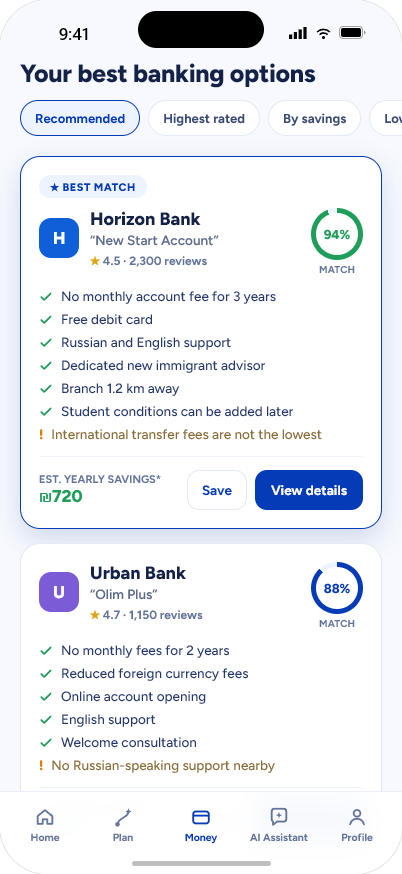
I placed fees, language support and a drawback together instead of asking the user to trust “best match”.
3 Prepare for the visit
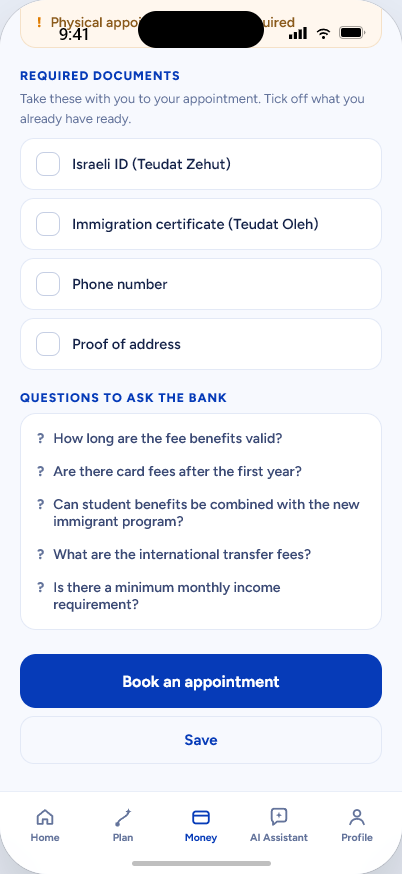
I turned the selected option into a checklist and concrete questions for the visit.
Evidence and limits
The selected bank carries through comparison, preparation, sample booking, plan and profile. I also checked keyboard operation, saved state and the demo retry path.
The concept has not been tested with newcomers. Its priorities, requirements and comparison logic need current official sources and user validation before real use.
Takeaway
My strongest decision was to treat the action plan as the interface, not as a result hidden behind chat. The next task, the reason for it and the preparation all stay inspectable.
If I continued the concept, I would first test whether newcomers understand and trust that priority. That evidence would decide whether to refine the plan model before expanding to more services.
Projects, roles & collaborations
For a project, team role or collaboration, email me with the context and timing.